Hey folks,
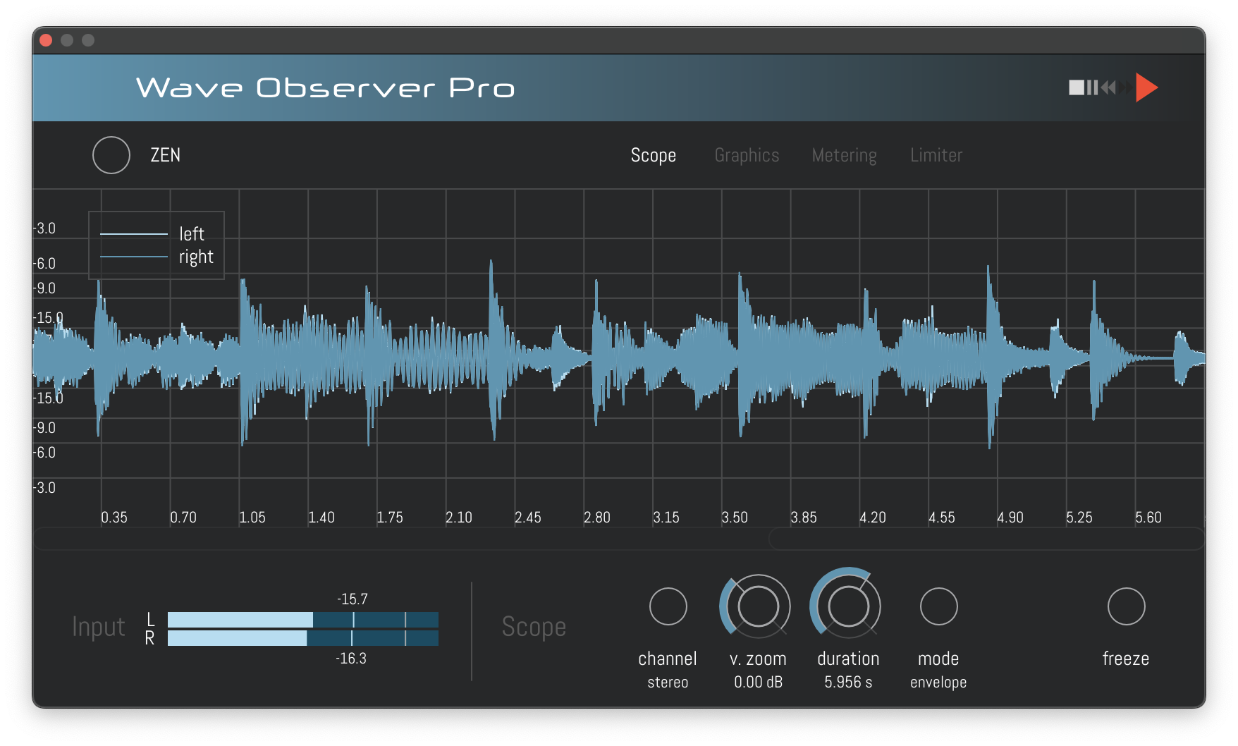
In terms of features, Wave Observer is still in its infancy. My goal is to make it the first choice when it comes to time-domain audio analysis. An important preparatory step for this is to enable various options and parameter controls without introducing too much clutter in the UI. Hence, I have been working on adding tabs which will show different controls depending on the tab selection.
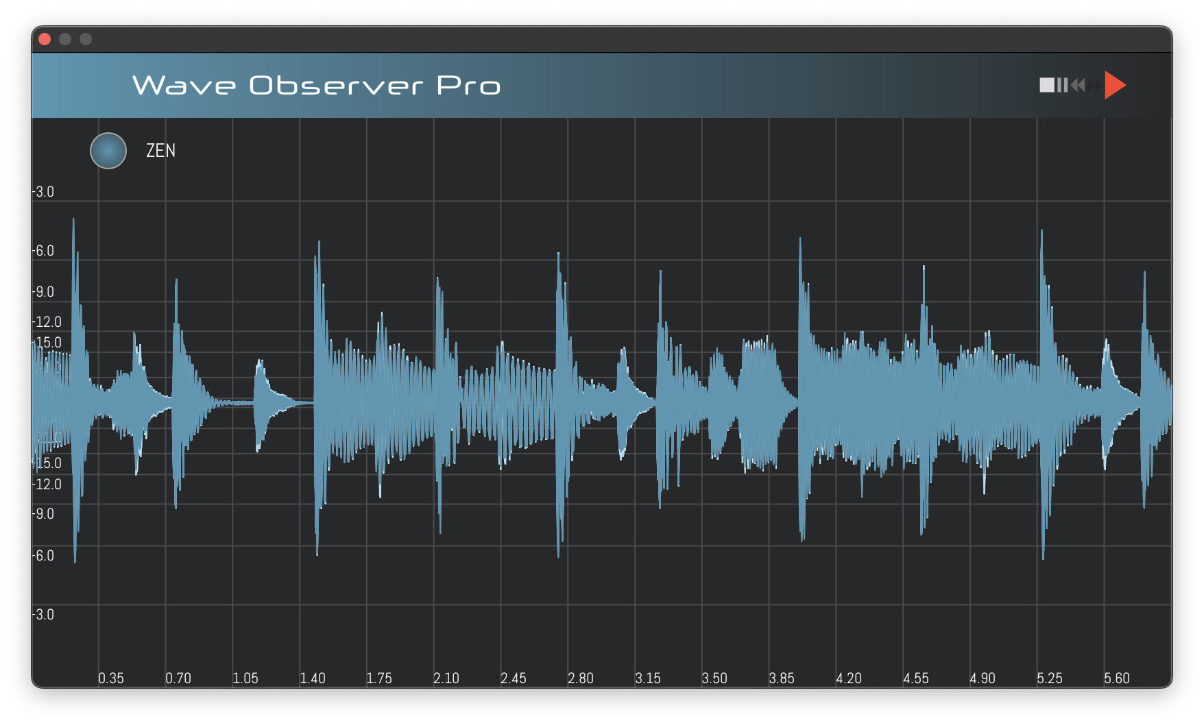
At the same time, I wanted to take the opportunity of the required redesign to start the implementation of a feature that was requested by some users: A view mode which would only show the oscilloscope without wasting “screen real estate” for knobs, sliders etc. I will call it the zen mode (as it will allow you to concentrate on the real nature of sound…).
Tabs and zen mode are already partly implemented. I made two sketches for demonstration of how Wave Observer Pro will roughly look like. Some things still need to be decided:
- Is freeze/scroll enabled in zen mode?
- If yes, where to put the freeze control?
- How will the transition between tabs look like? I started by fading between tabs, but perhaps sliding would look nicer.
- Does the current tab selection need to persist when closing the UI / the DAW?
- Switching between normal mode and zen mode changes the aspect ratio of the oscilloscope. Should the vertical zoom be automatically changed as well?
- …
Some of these questions can only be answered by obtaining user feedback, so be prepared for multiple iterations.
Watch your waves.
Cheers
Press Play


